The modern Web browser does not have to be so bland
We’ve seen amazing coverage of Vivaldi 2.0 but this ArsTechnica story still manages to stand out. Many in the Vivaldi team follow and respect this blog, so we were thrilled when Scott Gilbertson came out with such a positive, in-depth story a week ago. It’s packed with good stuff and well worth sharing!
"There is a little bit of a learning curve, but if you give it time and customize it, you'll find that Vivaldi feels really right. If there's something you don't like let us know, we're unique in how we listen to users." https://t.co/MAyYGVlTMb pic.twitter.com/RU7QFmCgse
— Ars Technica (@arstechnica) October 20, 2018
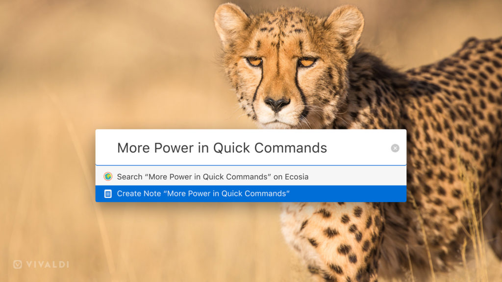
Focus on Quick Commands with 2.1
Some of our favorite tech media published pretty extensive articles on the 2.1 release. Take a look at Martin Brinkmann’s story on ghaks.net and Marius Nestor’s post on Softpedia. Nice coverage in some of our Ambassadors’ languages too – Chip (German), dobreprogramy.pl (Polish), itkvariat.com (Russian), and Kaldata.com (Bulgarian) amongst others.
Interview with Jon von Tetzchner in Russian
Хакер.ru talked to Jon just after the release of Vivaldi 2.0 and published this interview. We’re happy Jon got to interact with Andrey Pismennyi, the editor-in-chief. If you are one of our Ambassadors in Russia, this is a good opportunity to share something in your own language.
As always, a big thank you for sharing our stories and for helping us spread the word about Vivaldi! 🎉 Thank you all!
